User Tag List

Thanks useful information Thanks useful information:  2
Page 1 of 2 12 LastLast
Results 1 to 20 of 27

Thread: NTP Challenge : Genre : Landscapes

  1. #1
    Administrator ricktas's Avatar
    Join Date
    24 Jun 2007
    Location
    Hobart
    Posts
    16,846
    Mentioned
    12 Post(s)
    Tagged
    1 Thread(s)

    NTP Challenge : Genre : Landscapes

    To get our New to Photography members thinking about photographic genres and improving their photographic skills, we have decided to present a few genre based challenges to get you out photographing and thinking about what settings you should use. Also you get to show us your results and get some encouraging feedback

    So here is a link to some tips on Landscape photography: http://www.ausphotography.net.au/for...ad.php?t=16409

    Now we want you to put what you have learned in the New To Photography forum to use, and present a landscape photo here. This is not a competition and expect to get advice and feedback on your photos.

    Looking forward to seeing what you have to show us.
    "It is one thing to make a picture of what a person looks like, it is another thing to make a portrait of who they are" - Paul Caponigro

    Constructive Critique of my photographs is always appreciated
    Nikon, etc!

    RICK
    My Photography

  2. #2
    Member MYQ73's Avatar
    Join Date
    04 Mar 2010
    Location
    Townsville, Australia
    Posts
    25
    Mentioned
    0 Post(s)
    Tagged
    0 Thread(s)
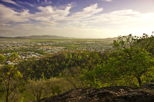
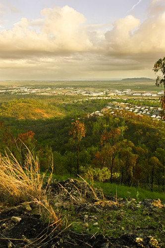
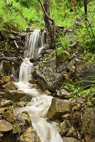
    Ok, Ill have a go at this and throw a few up to get things started ...
    1)


    2)


    3)

  3. #3
    Administrator
    Threadstarter
    ricktas's Avatar
    Join Date
    24 Jun 2007
    Location
    Hobart
    Posts
    16,846
    Mentioned
    12 Post(s)
    Tagged
    1 Thread(s)
    Hi,

    First off, post larger photos. Your photos uploaded to AP can be up to 1024 pixels on the longest side. It is much easier to view a photo that is 800/900/1000 pixels on the longest side, than 500 pixel ones.

    All three photos look good, well composed and exposed. The first one could have benefited from a polarising filter to give the sky blue a nice rich darker blue that made those wonderful clouds stand out more. The second one, that bit of tree on the right, I would have liked to not see it at all, or see more of it, to frame the shot, at present its just a few leaves intruding the right of the scene. The third is a very nice stream shot, that is composed very well, just watch the over-exposure of running water. The best time to photograph water to get the silky effect is on a very overcast day, or early morning, late evening.

    Overall some very good photos here, with nice light, compositions and exposures, they look sharp (hard to tell at the size presented) and the colours look great. All are interesting photos that capture our attention. But please, place larger photos on AP, as they are easier to see and critique.

  4. #4
    Member
    Join Date
    06 Dec 2009
    Location
    Sydney
    Posts
    135
    Mentioned
    0 Post(s)
    Tagged
    0 Thread(s)
    This was meant to be more of a wildlife photo, but the ducks were a bit too far away for the framing that I wanted, so it turned out more landscape. I think.
    Attached Images Attached Images

  5. #5
    Administrator
    Threadstarter
    ricktas's Avatar
    Join Date
    24 Jun 2007
    Location
    Hobart
    Posts
    16,846
    Mentioned
    12 Post(s)
    Tagged
    1 Thread(s)
    Very nice there Davros, overall a pleasing landscape shot. The one thing that detracts for me is the twigs in the foreground on the left. They are blurry due to the aperture used and depth of field, but they dominate that corner of the scene. When taking landscapes, compose your shot, then take a moment to look around the viewfinder and see if there is anything there that you do not want, move, recompose and check again. Good photographers will scan their viewfinder just before pressing the shutter to look for things like the twigs, or power poles sticking out of the top of people's heads etc.

  6. #6
    Member
    Join Date
    06 Dec 2009
    Location
    Sydney
    Posts
    135
    Mentioned
    0 Post(s)
    Tagged
    0 Thread(s)
    Quote Originally Posted by ricktas View Post
    Very nice there Davros, overall a pleasing landscape shot. The one thing that detracts for me is the twigs in the foreground on the left. They are blurry due to the aperture used and depth of field, but they dominate that corner of the scene. When taking landscapes, compose your shot, then take a moment to look around the viewfinder and see if there is anything there that you do not want, move, recompose and check again. Good photographers will scan their viewfinder just before pressing the shutter to look for things like the twigs, or power poles sticking out of the top of people's heads etc.
    Thanks for that. My original intent was to make the duck the subject of the picture, but I couldn't resist the reflections on the pond. The worst part was the blue building in the back ground -- turned brown in post. I have another shot with the foreground in focus, but there are people walking in the background which where a bit distracting.

  7. #7
    Member krissi835's Avatar
    Join Date
    03 Mar 2010
    Location
    Donald
    Posts
    96
    Mentioned
    0 Post(s)
    Tagged
    0 Thread(s)
    This scene looked so much better 3 nights ago when I saw it on my way to a meeting I was late for, however I thought I would go back and see what I find. Its very busy!

  8. #8
    Member krissi835's Avatar
    Join Date
    03 Mar 2010
    Location
    Donald
    Posts
    96
    Mentioned
    0 Post(s)
    Tagged
    0 Thread(s)
    for some reason the pic didn't load????

  9. #9
    Member krissi835's Avatar
    Join Date
    03 Mar 2010
    Location
    Donald
    Posts
    96
    Mentioned
    0 Post(s)
    Tagged
    0 Thread(s)
    I was in the Grampians today and took a stroll to the Silverband Falls. It must be good drinking water because many of the other tourists were drinking straight from them.
    Attached Images Attached Images

  10. #10
    dieselpower
    Guest
    Good idea Rick. Is the idea to go out and take a shot now or could I put one that I've already taken up?

  11. #11
    Account Closed
    Join Date
    03 Mar 2010
    Location
    -
    Posts
    181
    Mentioned
    0 Post(s)
    Tagged
    0 Thread(s)
    The water shots look a bit soft, what lens were you using?

    Would be good to use a slower shutter speed if possible and get a bit of movement to the water.

  12. #12
    Member krissi835's Avatar
    Join Date
    03 Mar 2010
    Location
    Donald
    Posts
    96
    Mentioned
    0 Post(s)
    Tagged
    0 Thread(s)
    Would have used slower shutter, however i didn't take the tripod and I have no idea why. I was in a bit of a hurry as always.

  13. #13
    Member robma47's Avatar
    Join Date
    20 Jan 2010
    Location
    Busselton
    Posts
    44
    Mentioned
    0 Post(s)
    Tagged
    0 Thread(s)
    Still trying
    Attached Images Attached Images

  14. #14
    Administrator
    Threadstarter
    ricktas's Avatar
    Join Date
    24 Jun 2007
    Location
    Hobart
    Posts
    16,846
    Mentioned
    12 Post(s)
    Tagged
    1 Thread(s)
    Quote Originally Posted by dieselpower View Post
    Good idea Rick. Is the idea to go out and take a shot now or could I put one that I've already taken up?
    Up to you, as long as you are new to photography. This thread it to help with advice. General critiquing photos are to be placed in the members photo forums.

  15. #15
    Administrator
    Threadstarter
    ricktas's Avatar
    Join Date
    24 Jun 2007
    Location
    Hobart
    Posts
    16,846
    Mentioned
    12 Post(s)
    Tagged
    1 Thread(s)
    krissi835, waterfall shots should be done on overcast days, either early in the day or into the evening, and in most cases a neutral density filter as well. A tripod is a must for slow shutter speed shots at any time (not just waterfalls). The last one is the best, but composition is also the key, you will find if you had a tripod, took them in low light, with an ND filter and composed the shots so we could see where the water pools at the bottom as well, your results would be much better. A polariser filter can substitute for an ND one as well.

  16. #16
    Administrator
    Threadstarter
    ricktas's Avatar
    Join Date
    24 Jun 2007
    Location
    Hobart
    Posts
    16,846
    Mentioned
    12 Post(s)
    Tagged
    1 Thread(s)
    robma47, two very nice scenes. The waterfall shot has a lot going for it, I think if we could see the bottom with the water pooling and possibly flowing off down the river, it would compositionally improve the photo. The second photo looks good, but the crooked horizon detracts. When you are about to take your shot, check the scene, look at your horizon level, look for things you see through the viewfinder that don't really work. Take the buildings down the right side, if you hold your hand up to the screen and block those out, it simplifies your photo, so composing it with a view slightly further to the left, it would have most likely given you a better, less cluttered scene that would work better.

  17. #17
    Member RLeadbetter's Avatar
    Join Date
    08 Feb 2010
    Location
    Cairns
    Posts
    66
    Mentioned
    0 Post(s)
    Tagged
    0 Thread(s)
    Ok here is my attempt.

    Shot 1


    Camera Model: Canon EOS 50D
    Lens: EF-S18-55mm f/3.5-5.6 IS
    Focal Length: 30.0mm
    Aperture: f/4.5
    Exposure Time: 0.600 s
    ISO equiv: 100
    Exposure Bias: none
    Metering Mode: Matrix
    Exposure: Manual
    Exposure Mode: Manual
    White Balance: Auto


    Shot 2


    Camera Model: Canon EOS 50D
    Lens: EF-S18-55mm f/3.5-5.6 IS
    Focal Length: 21.0mm
    Aperture: f/4.5
    Exposure Time: 6.000 s
    ISO equiv: 100
    Exposure Bias: none
    Metering Mode: Matrix
    Exposure: Manual
    Exposure Mode: Manual
    White Balance: Auto


    Shot 3

    Camera Model: Canon EOS 50D
    Focal Length: 30.0mm
    Aperture: f/4.5
    Exposure Time: 5.000 s
    ISO equiv: 100
    Exposure Bias: none
    Exposure Mode: Manual
    White Balance: Auto
    Criticism is always welcome..... Training in Progress

  18. #18
    Member
    Join Date
    23 May 2009
    Location
    Toowoomba
    Posts
    729
    Mentioned
    0 Post(s)
    Tagged
    0 Thread(s)
    I think I'm still new enough to photography (with DSLR) to post here.

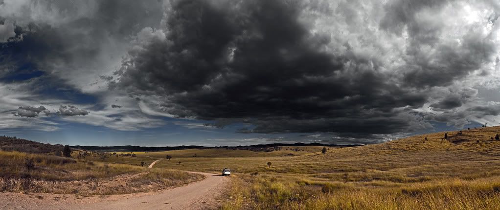
    This is one of my more pleasing landscapes. An 8 shot pano which I have played with to varying degrees in Photoshop. I'm still looking for just the right treatment before I decide to get this printed and framed.

    Attitude is everything!

    Cheers, Paul

    Nikon

  19. #19
    dieselpower
    Guest
    Hey Paul, this one looks a bit gloomy to me. The one on 4ROCs looks a bit washed out as a comparison. I like the blue in the sky on this one, but I think the darkness in that cloud makes it overall look quite dark - although maybe that's the point? I wasn't actually there for this photo as I was busy trying to start the fire back at camp so maybe it did actually look more like this?

  20. #20
    Member krissi835's Avatar
    Join Date
    03 Mar 2010
    Location
    Donald
    Posts
    96
    Mentioned
    0 Post(s)
    Tagged
    0 Thread(s)
    The water actually doesn't pool at the bottom. I have no idea where it goes. I think it must drain straight down into an underground cavern. It was an overcast day it was actually raining lightly. Next time I will definitely take my tripod and I think I will invest in a ND filter. Thanks for the input. It really helps.

Page 1 of 2 12 LastLast

Posting Permissions

  • You may not post new threads
  • You may not post replies
  • You may not post attachments
  • You may not edit your posts
  •