User Tag List

Thanks useful information Thanks useful information:  3
Page 2 of 5 FirstFirst 12345 LastLast
Results 21 to 40 of 97

Thread: NTP: Challenge VIII - Portraiture

  1. #21
    Ausphotography Site Sponsor/Advertiser DAdeGroot's Avatar
    Join Date
    26 Feb 2009
    Location
    Cedar Creek, Qld, Australia
    Posts
    1,890
    Mentioned
    0 Post(s)
    Tagged
    0 Thread(s)
    Quote Originally Posted by Adamm View Post
    My wife is heavily pregnant and i wanted to try some portraits and maternity shots as well as trying to use studio lights for the first time. So far the maternity shots haven't gone as well as hoped but this portrait was pretty good. What do you think?
    Not a bad first effort. Couple of points, firstly the eyes are probably not open enough, and as such the pupils appear dark and the eyelids puffy. Possibly tilting her head down slightly, and shooting from a slightly higher angle, wide-eyed and doe-like would provide a better outcome.
    Also the light on the right probably needs to be a little higher.

    You may consider some post-processing techniques in the final image to reduce some of the lines and smooth the skin (not too much, just to add that extra glow that most women are more than happy to see in a photo of themselves).

    Quote Originally Posted by daw67 View Post
    Open to comments.
    Ok, in this one, you have a few things you could have done differently (assuming a posed portrait rather than a candid).
    Firstly, eye contact. The gent is glancing off camera to the left, but there's nothing in the photo to suggest why. In general, go for looking at the camera, unless you're doing a wider angle portrait and it's obvious what the model is looking at.
    Shutter speed looks to be too low, as you have motion blur in the shot, leading to a lack of sharpness overall. If you're shooting in aperture priority mode, make sure your ISO is high enough to cater for the chosen aperture such that you maintain the 1/focal length shutter speed guideline.
    You also have mixed light sources, daylight on the left, and incandescent on the right. This gives you two different colour casts on model, blueish on the left side of the face, yellowish on the right side. You could fix that in post, but it's not easy. Better to light everything with flashes or remove one of the light sources (close the curtain, or turn off the lights) and work with a reflector to bring back the light on the side you'd now be lacking in light from.
    Finally, I'd consider a B&W version of this image. Old men with great facial features quite often benefit from B&W processing to really bring out the character.
    Dave

    http://www.degrootphotography.com.au/
    Canon EOS 1D MkIV | Canon EOS 5D MkII | Canon EOS 30D | Canon EF 400mm f/5.6L USM | Canon EF 70-200mm f/2.8L IS USM | Canon EF 17-40mm f/4L USM | Canon EF 85mm f/1.2L II USM | Canon EF 35mm f/1.4L USM | Canon TS-E 17mm f/4L & some non-L lenses.

  2. #22
    Member
    Join Date
    13 Dec 2008
    Location
    Sydney
    Posts
    2,048
    Mentioned
    0 Post(s)
    Tagged
    0 Thread(s)
    thought id throw this one in the mix .. an example of a nice posed yet relaxed natural light portrait. This ones got a bit of everything, a nice clean and simple background with just a little bit of detail in the timber, a leading line from the rail and nice contrasts between the background tones and the natural light on the models face .. I quite like this photo.

    Hi Im Darren

    www.darrengrayphotography.com

    SONY A850 (FF)] + GRIP | SONY A350 (APS-C) + GRIP | SONY NEX-5 +16 2.8 + 18-55 E-MOUNT LENSES | CZ 85 1.4 | 50 1.4 | 28-75 2.8 | 70-200 2.8 | 2 x 42AMs | 24" imac | LR | CS4 | + loads of other junk


  3. #23
    Site Rules Breach - Permanent Ban
    Join Date
    21 Jun 2009
    Location
    Brisbane
    Posts
    274
    Mentioned
    0 Post(s)
    Tagged
    0 Thread(s)
    How is this? I was testing out my cheap autofocus slr (Eos 3000N with 28-80mm f3.5) and came to like this picture...though her chin is chopped off as I over estimated the magnification of the viewfinder.


    Sorry if the quality is a bit terrible, I don't have an amazing scanner.

  4. #24
    Administrator
    Threadstarter
    ricktas's Avatar
    Join Date
    24 Jun 2007
    Location
    Hobart
    Posts
    16,846
    Mentioned
    12 Post(s)
    Tagged
    1 Thread(s)
    Good work Darren and Krzys

    Darren, your subject is very central, I reckon a crop of the right side would really give it a compositional lift. Good focus on your subject, nice exposure and sharpness is good. His clothing suits the location well .

    Krzys, great shot! Shows your subject off well, my only irk, is that I would have liked to see her whole chin in the shot. Nice eye contact but maybe her eyes are in shadow a bit to much and even something as simple as a piece of aluminium foil could have been used as a reflector to add some more light to her face. I like this shot a lot, well done
    "It is one thing to make a picture of what a person looks like, it is another thing to make a portrait of who they are" - Paul Caponigro

    Constructive Critique of my photographs is always appreciated
    Nikon, etc!

    RICK
    My Photography

  5. #25
    Site Rules Breach - Permanent Ban
    Join Date
    21 Jun 2009
    Location
    Brisbane
    Posts
    274
    Mentioned
    0 Post(s)
    Tagged
    0 Thread(s)
    Quote Originally Posted by ricktas View Post
    even something as simple as a piece of aluminium foil could have been used as a reflector to add some more light to her face. I like this shot a lot, well done
    This is a good Idea and thanks, however such aids are slightly unavailable when sitting in the park for lunch (I use glad-wrap thank you...)


  6. #26
    As Keen As Mustard NikonNellie's Avatar
    Join Date
    01 Jan 2009
    Location
    North West, Sydney
    Posts
    4,925
    Mentioned
    6 Post(s)
    Tagged
    0 Thread(s)
    Ok - this is a genre I do need much more practice on. It's hard trying to find a willing subject though. The only PP I did was a slight levels adjustment, noise reduction and a unsharp mask. Oh..... and I clone out his runny nose!
    Attached Images Attached Images
    CAMERA: Nikon D800, Nikon D7000
    LENSES: AF Nikkor 50mm f/1.8, Tamron SP AF 90mm F/2.8 Macro, Sigma 10 - 20mm F/4 - 5.6, Sigma 150 - 500mm F/5 - 6.3 APO DG OS, Nikkor 18 - 200mm F/3.5 - 5.6 VRII,
    Sigma 70 - 200mm f/2.8 APO EX DG OS, Tamron SP 24 - 70mm f/2.8 Di VC USD, Sigma 85mm F/1.4 EX DG, Nikkor AF-S 16-35mm F/4 ED VR, Nikkor AF-S 200-500 f/5..6E ED VR
    MY WEBSITES: www.nawimages.com, http://nelliewajzerphotography.smugmug.com/, http://NellieWajzerPhotography.blogspot.com


  7. #27
    Member
    Join Date
    13 Dec 2008
    Location
    Sydney
    Posts
    2,048
    Mentioned
    0 Post(s)
    Tagged
    0 Thread(s)
    Quote Originally Posted by ricktas View Post
    Good work Darren and Krzys

    Darren, your subject is very central, I reckon a crop of the right side would really give it a compositional lift.
    yea he is a little central Rick , i kinda cropped it like this to leave most of the railing in the shot ..

  8. #28
    Account Closed Harley's Avatar
    Join Date
    24 May 2009
    Location
    **Suburb/Town Required**
    Posts
    2
    Mentioned
    0 Post(s)
    Tagged
    0 Thread(s)


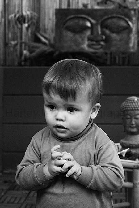
    I don't do this style very often, but I really went to get into peoples work.


    C&C would be fantastic.

  9. #29
    Administrator
    Threadstarter
    ricktas's Avatar
    Join Date
    24 Jun 2007
    Location
    Hobart
    Posts
    16,846
    Mentioned
    12 Post(s)
    Tagged
    1 Thread(s)
    Narelle, looks like he was moving a fair bit. Children shots can be hard cause they are always on the go and often it is a matter of following them around and being prepared for the right moment. It also looks like you shot this looking down from above a little. Try and get to the same height as your subject.

    Good effort and he looks like he doesnt mind the camera around him, very natural smile and expression. I reckon with some time, you could get a great shot of this young lad. I like how you have isolated him from all other things around him, making him the one thing in the photo to look at.

  10. #30
    Administrator
    Threadstarter
    ricktas's Avatar
    Join Date
    24 Jun 2007
    Location
    Hobart
    Posts
    16,846
    Mentioned
    12 Post(s)
    Tagged
    1 Thread(s)
    Harley, nice mono conversion and the grain adds to this one I feel. I found my eyes being attracted to the statues/faces in the background a bit to much. I reckon a crop of the right side and the top would really force me to look at your subject without finding my eyes wandering off to look at the extra elements.

    Good focus and depth of field

  11. #31
    Member GGR80's Avatar
    Join Date
    25 Jun 2009
    Location
    Scarborough, Qld
    Posts
    27
    Mentioned
    0 Post(s)
    Tagged
    0 Thread(s)
    This was the first day I had my camera a little over a week ago.
    Attached Images Attached Images

  12. #32
    Administrator
    Threadstarter
    ricktas's Avatar
    Join Date
    24 Jun 2007
    Location
    Hobart
    Posts
    16,846
    Mentioned
    12 Post(s)
    Tagged
    1 Thread(s)
    interesting angle GGR80. I am not sure it works as the first thing i did was tilt my head over to view it. Be careful taking photos of your subjects when they are looking down, the effect can make them look non-interested (or non-interesting to the viewer).

    I like the use of the fence to create a relatively plain background and it works, however the small amount of sky in the upper left makes us look up into that corner, away from the subject. So be careful and look around the viewfinder frame just before taking your shot and if there are things that distract or draw out attention away from the subject, recompose your shot before taking it.

    This photo made me think she was playing a nintendo DS or similar (mobile phone maybe), so it worked on a level of making me think about what she was doing.

    Eye contact with the lens is good. If you are not going to have eye contact, try and include what the subject is looking at, and incorporate it as part of the scene.

  13. #33
    As Keen As Mustard NikonNellie's Avatar
    Join Date
    01 Jan 2009
    Location
    North West, Sydney
    Posts
    4,925
    Mentioned
    6 Post(s)
    Tagged
    0 Thread(s)
    Thanks Rick - yeah it was hard to capture this little one. He is a bundle of energy, more so when his Aunt and Uncle are visiting. Maybe I should try his twin brother - he's a bit more shy but even more photogenic.
    I have just heard of two new pregnancies in the family so I will have a few more subjects to practice on in the near future. I think kids are much more interesting and challenging to photograph.

  14. #34
    Member GGR80's Avatar
    Join Date
    25 Jun 2009
    Location
    Scarborough, Qld
    Posts
    27
    Mentioned
    0 Post(s)
    Tagged
    0 Thread(s)
    Thanks for you comment and will certainly take all that you said into account for next time. We can only get better from all comments made.

    Cheers Retta

  15. #35
    Site Rules Breach - Permanent Ban
    Join Date
    21 Jun 2009
    Location
    Brisbane
    Posts
    274
    Mentioned
    0 Post(s)
    Tagged
    0 Thread(s)
    Quote Originally Posted by NikonNellie View Post
    I think kids are much more interesting and challenging to photograph.
    Try taking a portrait shot of a kitten!

  16. #36
    Member
    Join Date
    24 Jun 2009
    Location
    Northern Beaches, Sydney
    Posts
    2,338
    Mentioned
    0 Post(s)
    Tagged
    0 Thread(s)

    Here goes nuthin'

    Here's one that I took last weekend that i really liked.

    I have skipped a few challenges ahead, however had done the basics on my own over the last few weeks so won't bore you with those details


    f5.6, 1/125, ISO 125 (was on auto ISO....)

  17. #37
    Member
    Join Date
    16 Jan 2010
    Location
    Alberta
    Posts
    551
    Mentioned
    0 Post(s)
    Tagged
    0 Thread(s)
    I took this last week of a friends little boy. I tried editing gout all the food and dirt on him, but it just distorted the image, so i have left most of it, and it is just part of him.

    Canon 600D + Tamron 90mm Macro DI f2.8 + 50mm 1.8 II + 75-300mm + 18-55mm IS II + 430 EX II
    My Life In Frames

  18. #38
    Administrator
    Threadstarter
    ricktas's Avatar
    Join Date
    24 Jun 2007
    Location
    Hobart
    Posts
    16,846
    Mentioned
    12 Post(s)
    Tagged
    1 Thread(s)
    Hi andrea.

    Looks like you caught him on the move. There is some motion blur evident in this photo, especially across his t-shirt. However, that is not a bad thing as kids are often always on the go, and the motion blur shows a true representation of that. But, here is a question, do you know what settings to do, to counter motion blur?

    I also find the background here a bit distracting and I reckon if you could find a section of the yard with just shrubs or a fairly plain fence etc, and kept your subject a decent distance from that background, you would be on a winner.

    I love the dirty face. Kids are supposed to have dirty faces and happy grins, so you have captured a great and natural moment here.

  19. #39
    Member
    Join Date
    16 Jan 2010
    Location
    Alberta
    Posts
    551
    Mentioned
    0 Post(s)
    Tagged
    0 Thread(s)
    Thanks, Ummm to avoid the blur I would need to up the speed of my shutter I assume? It was a snapshot more then a posed picture, I was actually taking a pic of hom walking by, and he turned and smiled at me which was much better. Thanks for the input.

  20. #40
    Administrator
    Threadstarter
    ricktas's Avatar
    Join Date
    24 Jun 2007
    Location
    Hobart
    Posts
    16,846
    Mentioned
    12 Post(s)
    Tagged
    1 Thread(s)
    Yep Andrea, you would need to increase the shutter speed, but just doing that alone will mean less light hitting the sensor and your photo would be quite dark, so you would need also to either use a larger aperture (smaller f number) or increase the ISO, to ensure a correct exposure.

Page 2 of 5 FirstFirst 12345 LastLast

Tags for this Thread

Posting Permissions

  • You may not post new threads
  • You may not post replies
  • You may not post attachments
  • You may not edit your posts
  •