User Tag List

Thanks useful information Thanks useful information:  1
Results 1 to 16 of 16

Thread: Colour way more popular than B+W ?

  1. #1
    Formerly user: Arzuhl
    Join Date
    06 May 2011
    Location
    Acacia Ridge, Brisbane
    Posts
    618
    Mentioned
    0 Post(s)
    Tagged
    0 Thread(s)

    Colour way more popular than B+W ?

    Hey guys.
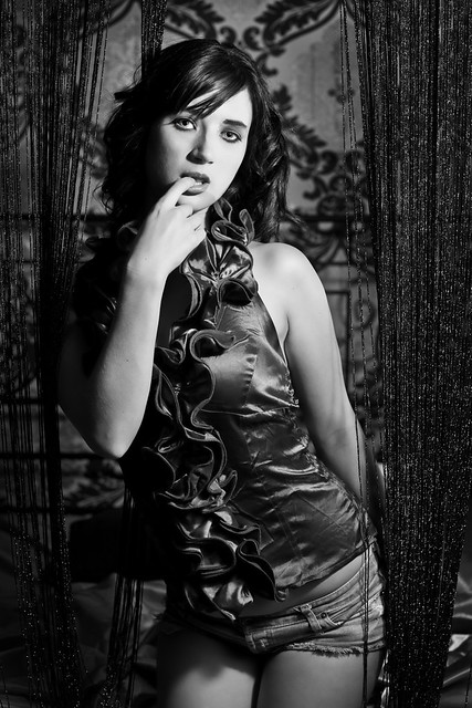
    Being a person who prefers B+W photography, I have found that B+W shots do not get the same number of hits or comments that colour shots do. i suppose the whole B+W thing is a very personal one, myself, I feel that B+W asks for a more emotional response from the viewer than does colour. i think B+W is harder to work in to achieve what the photographer is trying to say than colour, although the latitude for working in B+W is a lot broader than in colour, e.g dodging and burning, etc.
    Why is it that colour seems to appeal to people more than B+W ? Is it that people don't want to have to think about the shot and that it is easier to look at a colour shot and say "Wow, that's got great colour" rather than to spend the time to figure out what response the photographer is asking of the viewer?
    I realise that not all shots look great in B+W as not all shots look great in colour but as a general rule I feel most photographers and Joe public prefer colour. I have seen some stunning B+W work on this site that should have had more comments or hits than they have had.
    Interested to get feedback form both sides of the fence on this one.
    Cheers all.
    Cameras: Canon 5D MkIII, Canon 7D gripped.
    Lenses: 24mmmm f1.4 L, 24-105mm f4 L, 50mm f1.2 L, 85mm f1.2 II L, 70-200 f2.8 L IS II
    Flash: Canon 600 EX RT.
    Tripod: Manfrotto 190CX Pro3, Manfrotto Automatic Monopod, Manfrotto 498RC2 Ball Head.
    Bank Manager: Unhappy.


  2. #2
    Arch-Σigmoid Ausphotography Regular ameerat42's Avatar
    Join Date
    18 Sep 2009
    Location
    Nthn Sydney
    Posts
    23,523
    Mentioned
    24 Post(s)
    Tagged
    0 Thread(s)
    Sure?
    Done research?
    Got statistics?
    Dunno!
    I'll see what Joe thinks.

    Yeah. Maybe.
    Um
    CC, Image editing OK.

  3. #3
    Member
    Join Date
    20 Dec 2011
    Location
    Labrador Gold Coast
    Posts
    872
    Mentioned
    0 Post(s)
    Tagged
    0 Thread(s)
    Personally I really like b&w...it's like sprinkling mystical dust on a good photo...just enhances it. ( not that I have mystical dust, nor know anyone who does , but you get the
    drift ) and sometimes it gives the photo more character. A dog in a yard is a dog in a yard....a bw dog in a yard is a story trying to be told or a more detailed look at what's being portrayed.

    This is all my 2c of course.


    I often look at the bw. My dream gift would be silver efex pro

    one of the very best photos I absolutely love from here, is a bw treatment done on a city seascape......and this particular regular usually does color stuff.... And I think he got a lot of comments on it.....but no more I thought than his usual stuff. Waiting for it to go on sale or aspiring to do my own to hang - I can dream

    As a newbie I hesitate to comment often due to not believing I have enough to give as far as cc goes....opinions I have plenty of lol

    Not sure why others don't seem to say much


    Pentax K-r
    Da 15mm & 70mm Ltds, Fa 35mm f2, F 50mm f1.7
    Da*200mm, Tamron 90mm Macro, Sigma 28-105 f2.8
    _______________________________________________
    ***cc welcomed and appreciated***


  4. #4
    Member
    Join Date
    10 Jul 2010
    Location
    Gold Coast
    Posts
    6,346
    Mentioned
    0 Post(s)
    Tagged
    0 Thread(s)
    Good thread Graham, I have no idea on the Why or Hows, Most of my shots are colour , But I do some B&W as well, It usually comes to me while processing , I dont set out to give it the Mono treatment , I do like high contrast Mono's though , Interesting , will follow this thread , This is one of my favourites

    http://www.ausphotography.net.au/for...radise-in-Mono
    Last edited by William; 25-01-2012 at 9:00pm.
    Canon : 30D, and sometimes the 5D mkIII , Sigma 10-20, 50mm 1.8, Canon 24-105 f4 L , On loan Sigma 120-400 DG and Canon 17 - 40 f4 L , Cokin Filters


  5. #5
    Ausphotography Veteran
    Join Date
    08 Nov 2009
    Location
    Sydney
    Posts
    3,303
    Mentioned
    0 Post(s)
    Tagged
    0 Thread(s)
    I shoot predominantly seascapes, landscapes and cityscapes, and in the dawn and dusk light in which I shoot, there can be some magical colours.

    Just witnessing them with my own eyes is quite a pleasant experience, so when I'm photographing those scenes, I want to depict the colours.

    Take this seascape image of mine:


    This image is all about the magical colour. I wouldn't even consider running a B&W conversion on this, as the colour is a dominating feature of the image and isn't something I'd consider expendable.

    While I do run B&W conversions of some of my seascapes, while they look good in colour, the colour just isn't as big a part of the image as it is in an image like the seascape above.

    I think some subjects lend themselves well to B&W, and as a portrait shooter as well, I consider portraiture excellent for B&W.

    Take this portrait image of mine:


    I naturally shot it in colour, but I think B&W works very well for this type of image, and this type of portrait is not about the colour. The colour doesn't add to the mood or the personality of the character.

    If colour isn't an important part of the image, then it's probably expendable.

    My view is to try B&W conversions and see what works and what doesn't; but in my experience, 'scapes almost always look better in colour if the dawn or dusk colours are vibrant and pleasing. If an image is largely monochromatic, a B&W conversion can look good.

    For portraiture, while I always shoot in colour and mostly publish colour versions, I love a contrasty B&W portrait, and often process my images this way. Some are processed only with B&W in mind.

    PS: Kerrie, I have a feeling you might be referring to my dusk cityscape of Darling Harbour.
    Last edited by Xenedis; 25-01-2012 at 9:45pm.

  6. #6
    Member
    Join Date
    23 Apr 2010
    Location
    Allens Rivulet
    Posts
    462
    Mentioned
    0 Post(s)
    Tagged
    0 Thread(s)
    Agreed, this is a great thread, and one I've thought about on a number of occasions.

    Is it nature? We see (most of us anyway) in colour, so this is probably the default we think in when trying to capture a moment, or from the viewer's perspective, associating colour as 'normal'.
    Is it conditioning? It's contemporary to have images printed So many modern photo.
    Is it the photographer's eye? Some photographers picture the end result in either mono or colour, and look for scenes more suited to mono, or (should) consider what the final image should look like?
    Is it the tool? Viewfinders and LCDs are in colour, so do most people not consider B&W?
    Is it difficulty? Imagining in B&W or mono takes extra thought, but the photographer can adapt and train themselves, looking for different aspects.
    Is it herd mentality? Everyone else leans towards colour, why would I think differently?
    Is it the subject? Some subjects and moments are just better in colour, some in mono, but some can work in either. (Wow, isn't that subjective - 'just better in colour'?)
    Is it interpretation and story telling as you mentioned? Mono needs more interpretation - the removal of colours to me means more can be guessed, implied, read, attributed, abstracted from that moment of subject. But it's not the same in every photo - vibrancy of images may be a mental positive, while mono might also be stark. Again that comes back to the subject.
    Is it beauty and appreciation? It's impossible to appreciate some subjects in the wrong style.
    Is it just a different style? Mono means you need to concentrate not so much on the colours, but the lightness across the scene to provide contrast, both local and global.

    Personally I love mono - but I also love colour. Every genre and subject can be suited to either, but it's the photographer's final image and the story and execution that determines the interpretation and suitability for either. I've seen some colour photos that would be better in mono, but it's not always the other way around.

    Subjects such as sunsets: As an example, I'd have to say it's almost impossible to appreciate a sunset presented in mono as you can a colour one! (Maybe that's me? It's a subjective thing, but appreciation too) Similar with some types of landscapes - the colours in that particular setting at that particular time lend itself to colour.

    I've seen some photos where the photographer's converted it to mono to 'save' a photo that otherwise isn't great. In many cases that save doesn't work - it leaves more open to interpretation, but there isn't always that crossover or the elements that make a good mono.

    You've probably guessed my belief: every image is different, but it's how an image might be interpreted by the target audience that determines what makes it work. (Simple, huh? )
    Maybe what 'elements' make a good mono image will be your next post?

    I'm interested in following this one too

  7. #7
    Way Down Yonder in the Paw Paw Patch jim's Avatar
    Join Date
    27 Jun 2007
    Location
    Loei
    Posts
    3,565
    Mentioned
    2 Post(s)
    Tagged
    0 Thread(s)
    Where colour is an essential part of what you're trying to capture, of course you should shoot in colour. But personally I think many photos could benefit from conversion to black and white. If photography is largely about selection (and it is!) then the more irrelevant information you leave out of your photos, the stronger they are likely to be. And black and white photography has its own drama that colour rarely matches.

    However I think many of us shoot in colour and process in colour without ever considering black and white as an option. Perhaps those of us who like black and white should do more to encourage others to try it out.

  8. #8
    Member
    Join Date
    20 Dec 2011
    Location
    Labrador Gold Coast
    Posts
    872
    Mentioned
    0 Post(s)
    Tagged
    0 Thread(s)
    (PS: Kerrie, I have a feeling you might be referring to my dusk cityscape of Darling Harbour.)

    I will never tell.

  9. #9
    Ausphotography Regular
    Join Date
    25 Apr 2008
    Location
    Almere, NL
    Posts
    667
    Mentioned
    1 Post(s)
    Tagged
    0 Thread(s)
    There is a time and place for colour as much as there's a time and place for B&W. Black and white works great if the image has a strong graphical theme or if you are after certain certain dramatic effects. Just B&W for the sake of shooting B&W won't do your images any good. The images posted by Xenedis above are pretty good examples: that sunset looks great in colours but may be lost in B&W. That portrait in B&W uses some dramatic lighting that just may not work that good in colour.

    What I'm trying to say is there is no simple reason why B&W photo's would spark less comments than coloured ones. If you find in general you like B&W more than colour, you just may like graphically inspired images over others.
    Ciao, Joost

    All feedback is highly appreciated!

  10. #10
    Formerly user: Arzuhl
    Threadstarter

    Join Date
    06 May 2011
    Location
    Acacia Ridge, Brisbane
    Posts
    618
    Mentioned
    0 Post(s)
    Tagged
    0 Thread(s)
    Thanks all for your comments.
    I suppose this shot illustrates my point. As photographers we are trying to get the viewers of our photos to appreciate or to see/feel what we felt was special about the shot, why we even bothered to take the shot in the first place.
    I took this shot as a representation of what is happening in our world today, how some people are victims of the world around us whether by their own choice or not, how people are being forgotten about by governments, local authorities,etc and I was not just referring to homeless people basically using this person to represent us all, hoping to spark some comment not on the shot itself but also socially.
    This shot received 2 replies and 60 visits, so by my reckoning I failed in what I was trying to convey to the viewer. Would this have worked better in colour? I believe that B+W was the only way to show the starkness of this persons situation, the hopelessness. I personally believe this shot works on many levels yet it has failed to spark much feedback.
    (Maybe its too early in the morning for this heavy idealism)
    Cheers all.
    Attached Images Attached Images

  11. #11
    Member
    Join Date
    27 Jan 2011
    Location
    north west
    Posts
    113
    Mentioned
    0 Post(s)
    Tagged
    0 Thread(s)
    Graham, I think you can't really expect to invoke such a serious discussion about the plight of one or many, as you say you aimed to achieve with the street image, as it is essentially a critique section focusing more on the photograph rather than the subject.

    Having said that I agree, BW definitely gets less comments.

  12. #12
    Arch-Σigmoid Ausphotography Regular ameerat42's Avatar
    Join Date
    18 Sep 2009
    Location
    Nthn Sydney
    Posts
    23,523
    Mentioned
    24 Post(s)
    Tagged
    0 Thread(s)
    As "bxaftw" said (a mouthful in itself) so aptly.

    Me: well, how do you know what the picture evoked? (And I'm not critiquing it as such as that's for the appropriate section.)
    You quoted some statistics and you inferred some value from them. Where was it posted? Wow many People saw it? etc.
    How do you know that what ever you expected it to evoke was right?

    From this sort of experience you cannot draw too strict conclusions. Now when I first saw the picture I thought it was of a homeless destitute. But a few seconds regarding it showed evidence counter to that 1st impression. Look at the person's clothes, and also her luggage. Is that a money-bag tucked under her waist?

    After that I though, at worst a tourist who couldn't find a room for the night, and more likely, a staged shot. NOT THAT there's anything wrong with the latter. I mean, you would know more about the circumstances of the image/person.

    OK, so it's back to the general appreciation of B+W vs colour...

    Well, I don't know. Popularity also has to do with numbers engaging in a process, and the "world" is full of the means of reproducing colour...
    ....
    ....
    Am.
    Last edited by ameerat42; 27-01-2012 at 4:54pm.

  13. #13
    Member
    Join Date
    20 Dec 2011
    Location
    Labrador Gold Coast
    Posts
    872
    Mentioned
    0 Post(s)
    Tagged
    0 Thread(s)
    Quote Originally Posted by GrahamS View Post
    Thanks all for your comments.
    I suppose this shot illustrates my point. As photographers we are trying to get the viewers of our photos to appreciate or to see/feel what we felt was special about the shot, why we even bothered to take the shot in the first place.
    I took this shot as a representation of what is happening in our world today, how some people are victims of the world around us whether by their own choice or not, how people are being forgotten about by governments, local authorities,etc and I was not just referring to homeless people basically using this person to represent us all, hoping to spark some comment not on the shot itself but also socially.
    This shot received 2 replies and 60 visits, so by my reckoning I failed in what I was trying to convey to the viewer. Would this have worked better in colour? I believe that B+W was the only way to show the starkness of this persons situation, the hopelessness. I personally believe this shot works on many levels yet it has failed to spark much feedback.
    (Maybe its too early in the morning for this heavy idealism)
    Cheers all.

    Maybe because it is such a good photo, those that cannot critique without requesting or suggesting changes don't comment as they might figure you did a good job and don't require it. I feel silly sometimes just saying ' good job' as it holds no cc....but it's nice to let others know what you think either way i guess

  14. #14
    Ausphotography Addict
    Join Date
    22 Jun 2010
    Location
    Lake Macquarie
    Posts
    4,909
    Mentioned
    0 Post(s)
    Tagged
    0 Thread(s)
    FWIW I agree with Jim; unless the colour is important to the image it's better left out. Mind you, there are many images converted to mono that should NEVER be mono. They lose too much impact in the process. John's seascapes are a classic example. And mono treatment should not be yet another way to "rescue" a poor shot either (no I don't think yours is a "poor shot", Graham).

    The value in mono treatment is that it forces the viewer to assess the image on something other than being "bright and shiny". Ask yourself how many monochrome images have won a POTW, POTM here? Not many, that's for sure. People, like Bower Birds, are attracted to bright and shiny things.

    Now to your question, which has little to do with the mono vs colour treatment issue IMO. Getting 2 responses to almost any posting here is good going. Getting 60 views is even better. I think I've suggested to you before that Jungian extroverts like you and I just have to get over evaluating our worth on the strength of how many positive responses we get from others. CC forums simply aren't geared for copious positive responses; in fact this one specifically asks that any positive response be accompanied by the why's and wherefores that caused it. That can be just too hard for some people, so they look but don't comment unless they have something to really pithy to say beside "nice shot".

    I think your shot is very thought provoking, for a number of reasons. The framing of the sleeping person with the garbage and recycling bins is one element. The location being a bridge or overpass is another. The apparent evidence that the subject has all of their worldly possessions with them is yet another. And yes, the well-kept condition of the person's clothing creates a mental dilemma for the viewer wanting to pigeon-hole the homeless as unkempt or even dirty.

    My advice? Stop worrying so much about what feedback you're getting and start explaining your motivation more when you post. At least people will then be able to say "I think you've achieved that because..." or "I think you've missed the mark because ..." and they're not critiquing your photographic skills as much as your artistic intent. JMHO of course.
    Last edited by WhoDo; 27-01-2012 at 9:50pm.
    Waz
    Be who you are and say what you mean, because those who matter don't mind don't matter and those who mind don't matter - Dr. Seuss...
    D700 x 2 | Nikkor AF 50 f/1.8D | Nikkor AF 85 f/1.8D | Optex OPM2930 tripod/monopod | Enthusiasm ...

  15. #15
    Formerly user: Arzuhl
    Threadstarter

    Join Date
    06 May 2011
    Location
    Acacia Ridge, Brisbane
    Posts
    618
    Mentioned
    0 Post(s)
    Tagged
    0 Thread(s)
    Well if nothing I have opened some discussion on the subject.
    Thanks to all for their comments and opinions, much appreciated.
    Cheers to all

  16. #16
    Member
    Join Date
    23 Apr 2010
    Location
    Allens Rivulet
    Posts
    462
    Mentioned
    0 Post(s)
    Tagged
    0 Thread(s)
    Good to see the discussion happening Graham.

    And does it seem like there are more posts in mono since your post?

Posting Permissions

  • You may not post new threads
  • You may not post replies
  • You may not post attachments
  • You may not edit your posts
  •