User Tag List

Thanks useful information Thanks useful information:  1
Results 1 to 19 of 19

Thread: How would you edit this shot?

  1. #1
    Member OZAmateur's Avatar
    Join Date
    25 Oct 2010
    Location
    South East Melb
    Posts
    197
    Mentioned
    0 Post(s)
    Tagged
    0 Thread(s)

    How would you edit this shot?

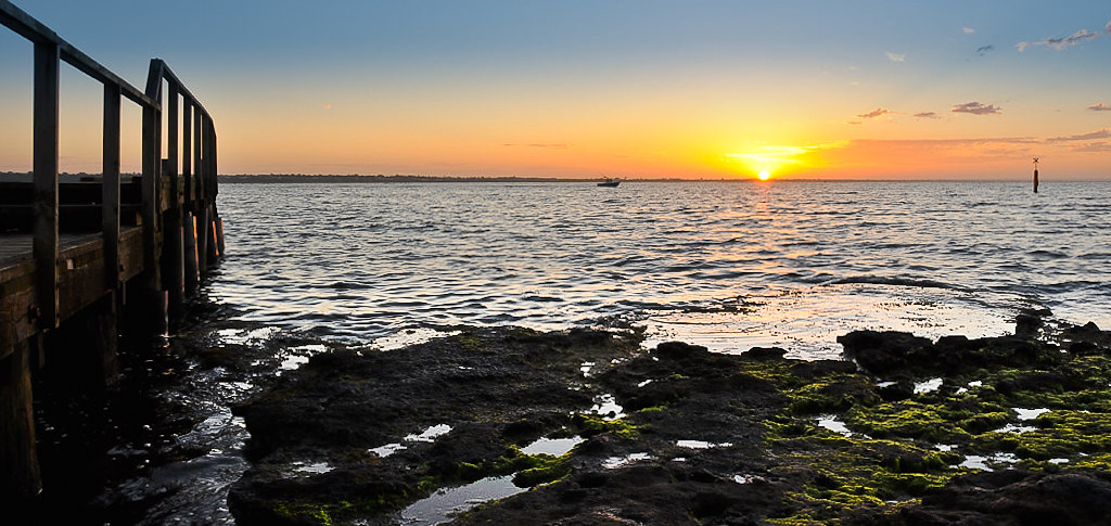
    Ive posted this up here as im more interested in how to best edit the shot to really make it stand out.
    For now im happy with composition etc, but i know that i can really make this shot sing...only problem is i just dont know how.
    I know you can do grad filters, layers to help bring out better detail in the foreground and a targeted adjustment tool to help bring out detail in the pier...but i dont know how or where to look to learn.

    Please offer your expertise.

    This is a unedited jpeg, i have a full sized RAW image which i intend to use when editing.
    Attached Images Attached Images

  2. #2
    Member nixworries's Avatar
    Join Date
    10 Sep 2010
    Location
    Collingwood Park
    Posts
    798
    Mentioned
    0 Post(s)
    Tagged
    0 Thread(s)
    i would be interested also to see what steps are needed also.
    canon 5D mark III tamron 24-70 2.8 vc, 50mm 1.8, tamrom 70-200 2.8 vc, remote tripod
    perseverance

    Rob


  3. #3
    Ausphotography Addict
    Join Date
    22 Jun 2010
    Location
    Lake Macquarie
    Posts
    4,909
    Mentioned
    0 Post(s)
    Tagged
    0 Thread(s)
    Here is my take on your original, OZ. It would have been easier and given better results to work from a full-sized original but I understand the limitations here. Steps below the image:

    Beau Sunrise-pp.jpg

    1. Crop to find the best composition possible - consider Rule of Thirds, leading lines, texture, patterns, points of interest.
    2. Perform Levels and Curves adjustments - restore colour and contrast to what you saw
    3. Sky lacked colour depth and interest so boosted with Multiply layer at 33%
    4. Foreground has good texture but too dark so boosted with Light layer adjustment at 66% and dodged in extra light for particularly dark rock areas.
    5. High pass filter sharpen to bring out more detail
    6. Edge mask sharpen (very light @ .7, radius 5, threshold 0)

    I might have taken more off the top to bring the horizon closer to the top third, but there was already very little to work with in terms of size so I left it in a portrait format. The jetty to the left was too far from the interest and didn't align well so I simply left it out. I considered cloning out the boat as a distraction but at this size it would have taken quite some effort to avoid being obvious in the result. Like I said, working from a full-sized original could have produced significantly better results.
    Last edited by WhoDo; 31-12-2010 at 9:49am.
    Waz
    Be who you are and say what you mean, because those who matter don't mind don't matter and those who mind don't matter - Dr. Seuss...
    D700 x 2 | Nikkor AF 50 f/1.8D | Nikkor AF 85 f/1.8D | Optex OPM2930 tripod/monopod | Enthusiasm ...

  4. #4
    Who me?
    Join Date
    02 Sep 2007
    Location
    Tweed Heads
    Posts
    2,746
    Mentioned
    0 Post(s)
    Tagged
    0 Thread(s)
    Ok heres my take on this one but first what I like about it, I like the idea of the wharf on the right leading in though a step or two to the left might have given it more length if you get my drift. I like the sun on the horizon on the opposite side of the frame, and like Waz says above a crop bringing the horizon closer to the third was my first step.

    Here goes
    Crop so the wharf top rail finishes in the top Left hand corner(helps emphasis a leading line). This crop also brings the horizon close to the upper thirds horizontal line.
    Levels adjustment(slight)
    Duplicate layer>change blending mode to Multiply>Layer >layer mask >Hide all. Fg colour white >select grad tool>drag from top to just above the rocks.
    Duplicate original laver>change blending mode to screen>Layer >layer mask >Hide all. Fg colour white >select grad tool> drag from bottom to just above the rocks.
    New empty layer>edit>fill>50% gray>change blending mode to Overlay(this becomes a Dodge and Burn layer)>Dodge to lighten the rocks a little further and to bring out some of the green moss> dodge the wharf to bring out a little more detail. Burn with a 100 size brush set at about 70% across the top of the frame to add a little darkness(depth).
    And thats about it.
    Hope you like it and hope the steps offer some help
    Attached Images Attached Images
    Cheers David.

    Canon 40D/EF-S 17-85 mm IS/Kenko Extenson Tubes/Canon EF 50mm F/1.8 II (nifty fifty)
    Sigma 10-20mm 4-5.6 /Sigma 70-200/ Sigma 1.4 teleconverter/ some Conkin filters | Adobe Photoshop CS6


  5. #5
    A. P's Culinary Indiscriminant
    Join Date
    21 Mar 2009
    Location
    Cronulla, Sydney
    Posts
    8,935
    Mentioned
    14 Post(s)
    Tagged
    0 Thread(s)
    The image lacks a little bit of strong interest point and Mongo is not sure that a lot can e done with it. However, here is a quick try.

    Crop off excess horizon and concentrate attention on remaining foreground.

    Increase contrast

    There are elements of light and colour which can be worked on to make it stand out a little more; particularly the pier on the left.

    Selectively add saturation (not too much as it will look false). Selectively highlight some of the areas in the water ( the area from the sun to foreground, along the front of the pier and some of the moss on the rocks). Graduate darkening of the sky from the horizon to the top of frame. Add vignetting ( a lot of people hate vignetting but Mongo thinks it has its place now and then) to top of image only. Other very minor bits and pieces but this is the bulk.
    Attached Images Attached Images
    Nikon and Pentax user


  6. #6
    Member
    Threadstarter
    OZAmateur's Avatar
    Join Date
    25 Oct 2010
    Location
    South East Melb
    Posts
    197
    Mentioned
    0 Post(s)
    Tagged
    0 Thread(s)
    WhoDo - i would never have thought to do a portrait crop of this shot (i really wanted a jetty and sunrise together) but i like what you have done and keep scrolling back up to have another look. With your crop is there a way to give a really defined colour graduation from the empty blue sky down to the orange horizon? A sort of blue fading down to orange?

    dbax - your edit is much more along the lines of what i was looking to do and i think the crop has made such a huge difference. I almost feel dejected after spending probably 5min (felt like an hour) trying to compose this shot so i wouldnt have to do a crop lol. (i took about 20 photos as the sun rose and tried to capture the boats flying past and also the birds)(strange fact - all the birds were flying from right to left, all the boats were traveling left to right?!?!?)

    I'm going to try and have a go at both edits and see how i go...i'll probably have a thousand questions about the grad layers and light layers.

    Thank you both for the effort you have given. i honestly just expected a hyperlink to some pages.

  7. #7
    Member
    Threadstarter
    OZAmateur's Avatar
    Join Date
    25 Oct 2010
    Location
    South East Melb
    Posts
    197
    Mentioned
    0 Post(s)
    Tagged
    0 Thread(s)
    Quote Originally Posted by mongo View Post
    The image lacks a little bit of strong interest point and Mongo is not sure that a lot can e done with it.
    More details please

    Quote Originally Posted by mongo View Post
    Selectively add saturation (not too much as it will look false). Selectively highlight some of the areas in the water ( the area from the sun to foreground, along the front of the pier and some of the moss on the rocks). Graduate darkening of the sky from the horizon to the top of frame. Add vignetting ( a lot of people hate vignetting but Mongo thinks it has its place now and then) to top of image only. Other very minor bits and pieces but this is the bulk.
    When you say selectively what do you mean? are you using a layer and specifically targeting an area or are you just editing the whole shot?

  8. #8
    Member hus's Avatar
    Join Date
    27 Dec 2009
    Location
    Sydney
    Posts
    313
    Mentioned
    0 Post(s)
    Tagged
    0 Thread(s)
    Here is my quick attempt for this pic.
    Attached Images Attached Images
    Last edited by hus; 31-12-2010 at 11:43am.
    The fastest way to a man's heart is through his chest with a sharp knife
    Canon 50D,
    Tamron 70-200 f/2.8, A very bright light, EF 50 f1.8, Tamron 17-50 f2.8

  9. #9
    A. P's Culinary Indiscriminant
    Join Date
    21 Mar 2009
    Location
    Cronulla, Sydney
    Posts
    8,935
    Mentioned
    14 Post(s)
    Tagged
    0 Thread(s)
    When we say it does not have a “strong point of interest” we mean that there is no obvious feature or thing which is the subject of the image – there is no single strong feature that stand out which led you to take the picture. Mongo suspects that in this case it was the sunset. However, unless that is a strong enough feature to carry our interest in the image, wherever possible, we try to marry that up with some other related and complimentary feature to “carry “ the image. This is not always possible. For example, some sunsets are carried by amazing cloud structure which are lit up by the sunset and do not need anything else to capture and hold our interest in the image. Mongo has included a sample image of what he thinks might be an example of this.

    When Mongo says “selective”, he means just that – i.e the effects are not applied to the whole image but just to some select portions. There are many ways of doing this but layers is the one most commonly used and convenient . Layers was used in Mongo’s edit of your image. Create a duplicate layer of the image ( ie the image with a copy of the image on top of it), apply the changes to the bottom layer and selectively remove portions of the top layer to reveal portions of the bottom image which has the effects you wanted to bring out as part of you top image and them merge them together when you are happy with the look of it.

    You can use multiple years to do this – each with its own effect that you wish to introducing into your image OR you can do it 2 layers at a time merge them when the effect has been applied and then start again ie duplicate that layer and apply a separate extra effect, blend that in and merge those layers and so on until you have the finished product.
    Attached Images Attached Images

  10. #10
    Perpetually Bewildered
    Join Date
    13 Sep 2009
    Location
    Sydney
    Posts
    1,244
    Mentioned
    1 Post(s)
    Tagged
    0 Thread(s)
    If you get the chance OZ it might be worth re-shooting this location when there is some cloud cover about. My attempt was similar to others, but I pushed the colour a bit further as there is not much happening in the sky.


    Beau Sunrise-EDIT.jpg


    1. I created a layer mask using Filter / Adjustments / Threshold to separate the water and sky from the jetty and rocks

    2. Applied a Multiply layer (at 100%) to the water + sky part of the image to boost saturation

    3. Applied Lighten Shadows to the rocks + jetty part of the image to bring a bit more detail to the shadow areas

    4. Straigthened horizon and a bit of sharpening


    Edit: ...and cropped, obviously

    Cheers.
    Phil.

    Some Nikon stuff. I shoot Mirrorless and Mirrorlessless.


  11. #11
    Ausphotography Addict
    Join Date
    22 Jun 2010
    Location
    Lake Macquarie
    Posts
    4,909
    Mentioned
    0 Post(s)
    Tagged
    0 Thread(s)
    Quote Originally Posted by OZAmateur View Post
    WhoDo - i would never have thought to do a portrait crop of this shot (i really wanted a jetty and sunrise together) but i like what you have done and keep scrolling back up to have another look. With your crop is there a way to give a really defined colour graduation from the empty blue sky down to the orange horizon? A sort of blue fading down to orange?
    I only went for the portrait crop because I thought there was too much distance between the wharf and the sunset for them to be complimentary; I felt they competed for attention. That said I do like what dbax and mongo have done because in cropping to thirds they have forced the eye from the wharf along the horizon to the sun as an articulated leading line, successfully tying the two together.

    To apply a colour fade as you asked I would use a software Graduated Filter and change the colour of the grad to the darkest blue at the top. That will then multiply at the top and fade down into the orange of the sunset at the horizon. I hope that's what you're looking for.

    Cheers.

  12. #12
    Member
    Join Date
    30 Oct 2006
    Location
    Bris Vegas
    Posts
    1,102
    Mentioned
    0 Post(s)
    Tagged
    0 Thread(s)
    hey

    here is my go...

    happy to send you my PSD if you want to see what i did

    lightend the lower section

    darkened the upper section (both with levels) and blended them together a little

    added some clouds and made the sunset a little better,
    given the image a slightly bluish tinge to make it more realistic, and yeah i think the reds are too far gone in the above examples...

    PM me your email address if you want the PSD... but it is largish

    M
    Attached Images Attached Images
    www.pbase.com/mcphotographics loooots of pictures!
    hmmm Eq list... 1D II, 5D II, 7D, 100-400 LIS F4.5-5.6, 70-200 F2.8L, 135 F2, 85 F1.8, 24-70 F2.8L, 16-35 F2.8L, 420EX, 580EX II x2 ST-E2 Cir polar filters and much much more all in a neat back pack that kills my back!

    Adobe CS5
    Week 16 Sheep Winner
    If you have a question about car / action / sports photography or Canon Cameras PM me...

  13. #13
    Member
    Threadstarter
    OZAmateur's Avatar
    Join Date
    25 Oct 2010
    Location
    South East Melb
    Posts
    197
    Mentioned
    0 Post(s)
    Tagged
    0 Thread(s)
    Ok, so here is my attempt at fixing up the photo.
    Ive done 2, one of the crop just above the pier, and the other non crop.
    i had a play with grad filter in raw editor and like how i could select how far down i wanted the filter to work, but couldnt do the same once i opened the photo for further editing. ill have a look at some online tutes.
    i also had a bit of a play with selected layer adjustment (another first) lightening up the rocks and pier. the cropped photo had a dodge and burn (dodged to rocks and water burn to sky)(another first)

    what do you guys think?


    Sunrise from scout pier by PsychoPuppie, on Flickr


    Sunrise from scout pier crop by PsychoPuppie, on Flickr

  14. #14
    Ausphotography Addict
    Join Date
    22 Jun 2010
    Location
    Lake Macquarie
    Posts
    4,909
    Mentioned
    0 Post(s)
    Tagged
    0 Thread(s)
    I think the cropped, almost pano, version works better OZ. I also think your reworked versions are "soft"; i.e. they need some sharpening. Try a high pass filter sharpen at about strength 7.0 and follow with an edge mask sharpen with amount 0.5 and radius 1.0 to start. Neither of these are strong enough cause any glaring artefacts but you should still see some visible improvement in overall clarity. I hope that helps.

    BTW, in both versions you can see visible halos where you've attempted to lighten the distant shore line, in behind the wharf on the left, and the front support of the wharf. You will find a routine work flow that suits you and this stuff will get better over time. Keep trying different things and don't get discouraged if you have to start again from scratch. Once you have settled your work flow it will all happen much more quickly.
    Last edited by WhoDo; 01-01-2011 at 10:39pm.

  15. #15
    Member
    Join Date
    23 Jul 2009
    Location
    Gold Coast
    Posts
    655
    Mentioned
    0 Post(s)
    Tagged
    0 Thread(s)
    This is my attempt in lightroom,
    I ran a grad filter on the sky, added some blue in the filter, took the filters saturation down a touch, this managed to get a bit more blue in the sky, but lost a little bit of orange,
    then added a little fill light,and global contrast, saturation and sharpness.

    Not sure if this would make a difference, but if you do shoot it again, maybe try a bit more of an angle to the jetty so you see more of it.

    Jayde

    Honest CC whether good or bad, is much appreciated.
    Love and enjoy photography, but won't be giving up my day job.

    Flickr

  16. #16
    Ausphotography Regular
    Join Date
    27 May 2009
    Location
    Woy Woy - Central Coast
    Posts
    914
    Mentioned
    0 Post(s)
    Tagged
    0 Thread(s)
    Hi

    this is my attempt using Nikon's Capture NX2.

    1. Cropped to rule of thirds
    2. Applied Nik Color Efex Glamor Glow filter.
    3. Applied Nik Tonal Contrast filter.
    4. A little High Pass sharpening.

    aBeau Sunrise1.jpg
    David

    Nikon D810
    Nikkor AF-S 24-120VR, Nikkor AF-S 16-35VR, Nikkor AF-S 70-300VR, Nikkor AF 50 f1.8
    Tamron 90mm Macro

  17. #17
    Account Closed reaction's Avatar
    Join Date
    18 Sep 2008
    Location
    Sydney
    Posts
    788
    Mentioned
    0 Post(s)
    Tagged
    0 Thread(s)
    I see a lot of rule of thirds examples. Personally I would take EV down a bit, and crop top/bottom with horizon in/near the middle.
    the sky's not so great, but I don't like too much of the bottom either...

  18. #18
    Member
    Join Date
    18 Nov 2010
    Location
    Brisbane
    Posts
    1,988
    Mentioned
    1 Post(s)
    Tagged
    0 Thread(s)
    And my effort, from one with pretty basic Photoshop CS4 skills:

    1. Duplicated Background Layer to which I added a layer mask
    2. Inverted the Layer Mask with Control I to make it black
    3. Selected the mask then selected the area above the horizon and filled it with White, (all this to have a non-destructive method)
    4. Using the Curves adjustment layer, I pulled the curve down in the highlight area of the histogram on the RHS to darken the sky and lift the sunset
    5. Shift+Control+Alt +E to get a Stamp Visible layer
    6. Dodged over the shadows of the rocks at 11% exposure and part of the pier to lighten these areas
    7. Unsharp mask at 85, radius 1.0, threshold at 3

    Beau Sunrise edit.jpg

  19. #19
    Member gtpete's Avatar
    Join Date
    09 Oct 2010
    Location
    Blue Mountains
    Posts
    2
    Mentioned
    0 Post(s)
    Tagged
    0 Thread(s)
    the crop version looks fine but i think the sky is a little over exposed.

Posting Permissions

  • You may not post new threads
  • You may not post replies
  • You may not post attachments
  • You may not edit your posts
  •