


 Thanks useful information:
For a little while I've been meaning to prepare a Photoshop post-processing tutorial on my image The Narrabeen Gorge, but only in the last two days have I finally produced it.
The tutorial is published on my photography blog, but I have reproduced it here so that you can learn here what went into the processing of this image.
It's a long post, but please enjoy anyway.
Post-Processing Tutorial: "The Narrabeen Gorge"
In July I headed to Narrabeen for a Sunday dawn shoot.
Narrabeen and nearby Turimetta is a location I've photographed a few times before, but on this day the sky was moody.
One of my standout captures of the morning is The Narrabeen Gorge. Here it is:
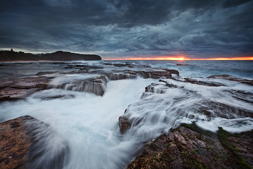
On this particular morning the conditions were perfect for photographing this fantastic gorge, into which water from the oncoming waves dramatically flows, producing thrilling splashes and photogenic cascades of water. Combined with the moody sky, it was an image I had to have.
In this article I will explain the post-processing techniques I applied to this image.
Firstly, some details about the capture phase and equipment:
- Camera: Canon EOS 5D Mark II
- Lens: Canon EF 16-35mm f/2.8L II USM
- Filter: Lee 0.9 (three-stop) graduated neutral-density
- Focal length: 16mm
- Shutter speed: 0.4 seconds and one second
- Aperture: f/8
- Sensitivity: ISO 200
The final image is a blend of three exposures. I shot many frames of the same composition, as there was much action and I wanted to give myself the most options in terms of interesting water movement.
The three images I used for the final image were exposed as follows:
As can be seen, the settings for the latter two exposures are identical. Here is where there was different water movement, and I later blended the water from both images to create a more appealing composition. I will explain that later in this article.
The earlier exposure was longer, and while exposure was not a problem in these conditions, as is my usual practice I under-exposed and over-exposed the scene marginally to maximise my potential for capturing detail. I used the longer exposure to brush in rock details in the foreground.
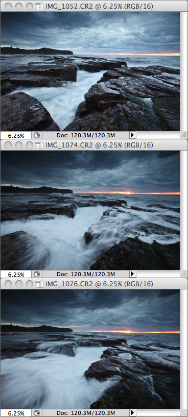
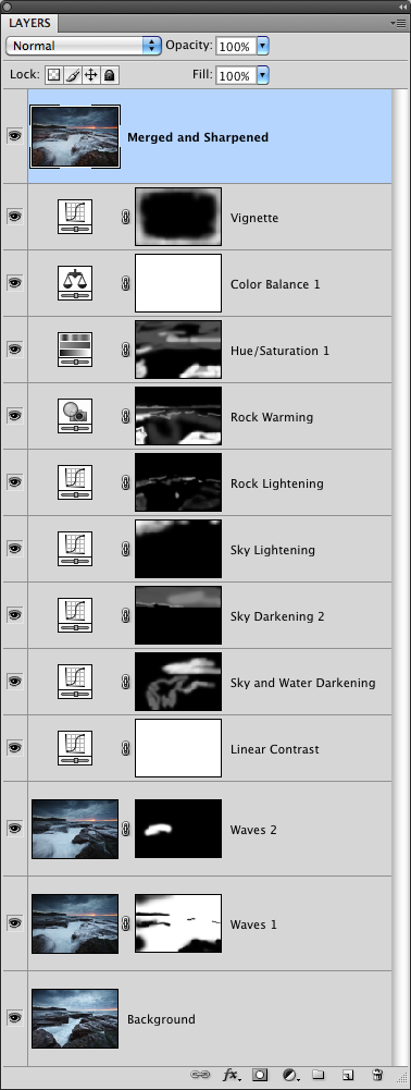
As part of this tutorial there are two screen captures to view:
- my raw source images (after initial processing in the raw converter); and
- my Photoshop layer stack (showing my various adjustment layers).
These will both be helpful when you read about the processing I did.
Here are my raw source images:
And here is my Photoshop layer stack:
Now, onto the processing.
Step 1 - Raw Conversion
I loaded my raw images into Adobe Camera Raw and made the following adjustments:
- Camera Profile: Camera Standard
- White Balance: Auto
- Clarity: +60
- Sharpening Amount: +65
I then loaded the three raw images in Adobe Photoshop CS4.
Step 2 - Distortion Correction and Horizon Straightening
A 16mm lens (even a pro-grade lens) will generally result in the horizon bowing, especially if you compose as per the rule of thirds as I mostly do, and your horizon is therefore towards the edge of the frame.
When shooting in the dark and looking through a viewfinder (even a full-frame viewfinder) or live view screen with no grid as reference lines for straightness, the horizon is often very slightly crooked, by a matter of maybe only half a degree to two or three degrees. I am quite fussy, so I correct that as much as possible.
I fired up the Lens Correction filter (Filter -> Distort -> Lens Correction) and tweaked the barrel distortion and horizontal perspective sliders to correct the image as much as possible.
I cropped away as minimally as possible the undesirable borders and edges introduced as a result of image rotation.
Step 3 - Merging the Source Images
At this stage I had three separate, horizon-corrected images. I needed all three images to be merged into the one file, with each image occupying its own layer.
I decided to use the lighter exposure as the base or background layer. I then selected the first darker exposure, copied it and pasted it on top of the lighter image. I repeated the process with the other darker exposure.
I now had a single image with three layers:
- the lighter base layer; and
- the first darker layer with particular water detail; and
- the second darker layer with different water detail.
The next step was to start manually blending the three exposures.
Step 4 - Water Blending
I now had desirable detail from three images.
In the base layer I wanted the lighter (but not over-exposed) detail in the rocks. There is no cascading water in the base layer, so I added a layer mask to the second layer (ie, the first water cascade image), inverted it (ie, changed it to black) and brushed in much of the detail from the second layer, including the darker, moodier sky, and the cascading water.
That first darker exposure contains some nice water cascades, but the jagged rock positioned left of the middle of the frame is lacking water. In a later exposure I had captured water cascading off this rock, and I wanted that detail in my final image, so I added a layer mask to that third layer, inverted the mask and brushed in only the water that was cascading off that particular rock.
The result was now a more dramatic, fuller image with interesting water movement throughout the scene.
Step 5 - Contrast Boost
The next layer I added was a curves adjustment layer to boost the contrast. I used the Linear Contrast preset, which subtly adjusts the highlights and shadows without going overboard. This simple adjustment boosted contrast and colour intensity in a subtle, but noticeable way.
Step 6 - Sky and Water Darkening
While I had a decent-looking image, there was still more to be done, and what I wanted at this point was some darkening in the sky and water to create more mood and increase the contrast and the drama.
To achieve this I added another curves adjustment layer and dragged the curve downwards to apply uniform darkening by about a stop or a stop and a half of exposure value. Because I wanted that darkening only in certain areas (namely the lighter part of the sky around the sun, and the water in the mid-foreground, I added a layer mask, inverted the mask to disable the effect, and then brushed in the darkening in the areas where I wanted it applied.
Step 7 - More Sky Darkening
I wanted a moodier sky, so I added another curves adjustment layer, dragged the curve down, added a layer mask, inverted it, and then brushed in the darkening effect in the sky portion only, especially in the lighter areas to the right of the scene.
Step 8 - Sky Lightening
In the previous step I darkened the sky using a curves adjustment layer. Why, pray tell, would I then lighten the very sky I had darkened?
Quite simply, I considered the sky occupying the left side of the scene to be too dark, so it needed lightening. It is a good idea to keep lightening and darkening (or dodging and burning) actions in separate layers for ease of management.
In this case, I wanted a more evenly-toned sky, so almost identically to the previous step, I added a curves adjustment, but this time I dragged the curve upwards to lighten the sky. I added a layer mask, inverted it and brushed in the lightening effect only in the portion of the sky I considered to be too dark.
Step 9 - Rock Lightening
In this step I added another curves adjustment layer to lighten the rocks and bring out some more detail. To my eyes the rocks were a little on the dark side -- not too dark to retain detail, but dark enough to warrant mild lightening.
On my layer mask, I brushed in the effect of a lightening curve to bring out those rock details a little more.
Step 10 - Rock Warming
Those who are familiar with the light at various times of the day will recognise that dawn light, especially under cloud cover, is very cool in colour temperature. To my eyes the rocks were tonally too cool, so I wanted to inject some warmer colour into them.
To achieve this, I added a photo filter adjustment layer. I chose the Warming Filter (85), which is a nice, warm orange, dialled in 41% density, and brushed in the warming effect onto the rocks via an inverted (ie, black) layer mask.
At this point the image was looking better, and within a predominantly cool blue scene there was some warmth to those rocks to balance the warm sliver of light on the horizon.
Step 11 - Saturation Increase
I tend to often apply selective saturation adjustments to my seascape images, as it gives them more visual appeal and more life.
I created a new hue/saturation adjustment layer, and as per most of the steps performed thus far, I added a layer mask and inverted it. The benefit of inverting a layer mask is that by default the effect is not visible due to the black mask, which blocks the effect. I learned a while back that it is easier to brush an effect in than globally apply it and then, somewhat counter-intuitively, brush the effect out of areas where it is not wanted.
In this case I brushed in the increased saturation (+30 on the slider) in the sky and rock areas; the white water was left untouched.
Step 12 - Colour Balance
At this point I still found the image too cool in colour temperature, so I decided to tweak the colour balance globally.
I added a colour balance adjustment layer and started fiddling with the sliders until I achieved a result that was visually appealing.
I worked only on the mid-tones, and settled on the following adjustments:
- Cyan-Red slider: +12
- Magenta-Green slider: 0
- Yellow-Blue slider: -10
In short, I've added red and decreased blue by very similar amounts.
The image was looking much more tonally even at this point, and had a warmth which offset the cool blue inherent in the scene in those conditions.
Step 13 - Vignetting
One technique used by landscape/seascape photographers like Peter Eastway and Brent Pearson is the use of a vignette to draw the eye into the scene. Within the last few months I have found this simple but subtle treatment to be very effective in my seascapes, and it has now become a regular part of my seascape image processing.
To create a darker edge to draw the viewer into the action, I added a curves adjustment layer, dragged the curve down, added a layer mask, inverted the mask, and lastly brushed in the effect around the edges. I used fairly aggressive opacity to darken those extremities.
Step 14 - Sharpening
My post-processing is, for the most part, non-destructive, in that the adjustments I make via adjustment layers do not modify the original pixels; the effects are merely stacked on top of the source image(s).
In just about all cases, my final step is destructive, but I perform it non-destructively (yes, it sounds crazy, but bear with me). How I achieve this is by creating a new layer which is a composite of all layers beneath it. At this stage I already had 12 layers.
The way to create a new layer consisting of all lower layers is to:
- select the top layer first (this is very important); and
- press Apple-Option-Shift-E (on a Mac) or Ctrl-Alt-Shift-E on a PC.
I then had a new layer combining all of the previous post-processing I did.
Using the selection tools, I selected all areas other than the sky and applied the smart sharpen filter at 40% or 50% to boost the gritty sharpness of these areas.
All done!
And that concludes my post-processing tutorial on The Narrabeen Gorge.

 Reply With Quote
 Add To Bookmarks

 Nikon
Nikon Threadstarter
 Nikon D810: D600 (Astro Modded): D7200 and 'stuff', lots of 'stuff'


